
2021-2025
︎ Kyoto Sukiya 001#︎ Kyoto Machiya 001#
︎ Kamogawa House
︎ Fengyuan Art Museum
︎Zhuhai Office Building
︎ Hangzhou Guest house︎ Landmark Buildings of Quzhou
︎ An Apartment in Guiyang
︎ Boutique hotel in Inner Mongolia
︎ Shenzhen Commune
︎ Slow Yard
︎ sanga Restaurant
︎ D Apartment
2016-2020
︎ Narrative Space
︎ Deck Apartment
︎ Shen Zhen School 001
︎ DJI︎ Community Library
︎ West Kowloon Pavilion
︎ AN+ Museum
︎ SONGTA Space
︎
Mountain House
OBJECTS
︎
Foldable Table
︎
Steltman
Chair
︎
Pop-up ︎ Todaymood
SANGA Restaurant
DESCRIPTION
This project explores spatial freedom within functional constraints, inspired by Mies van der Rohe’s concept of “freely spaced planes.” Traditional dining layouts often feel either too open or too closed; here, the design seeks balance—dynamic yet calm, open yet private—through rhythm, light, and material.
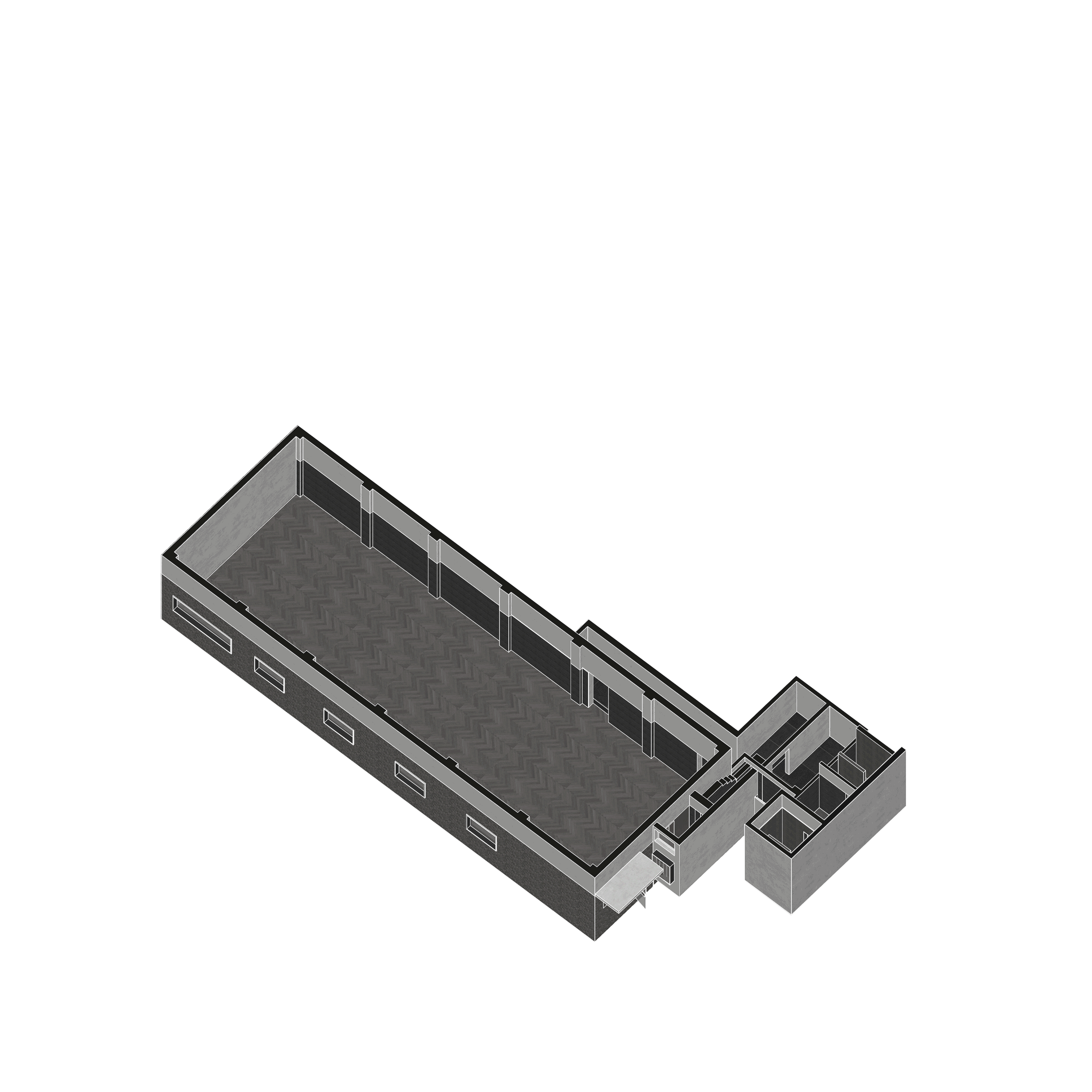
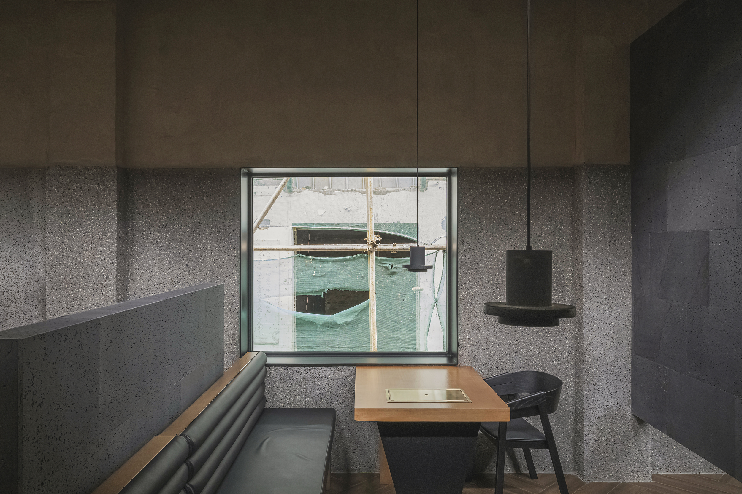
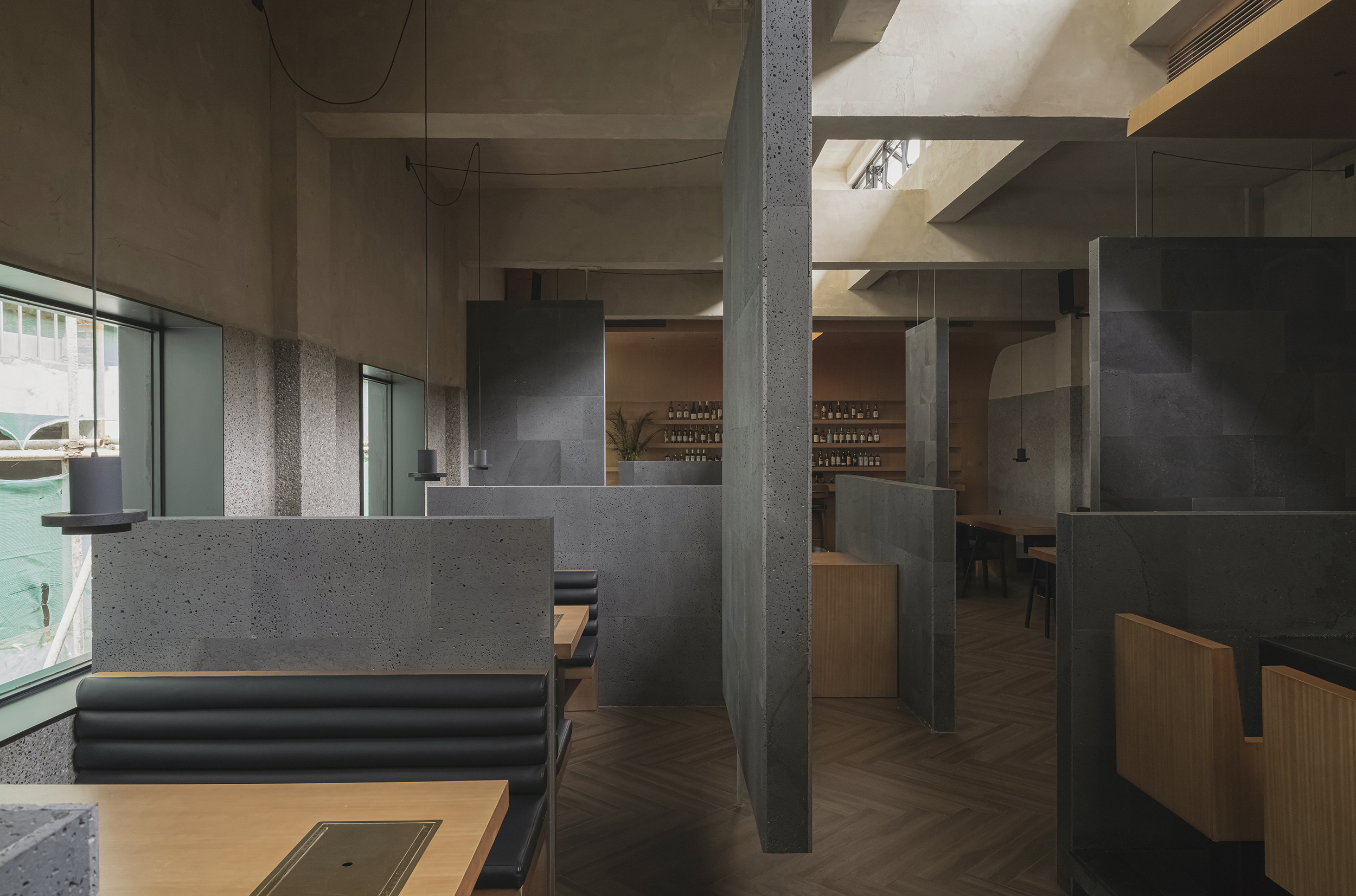
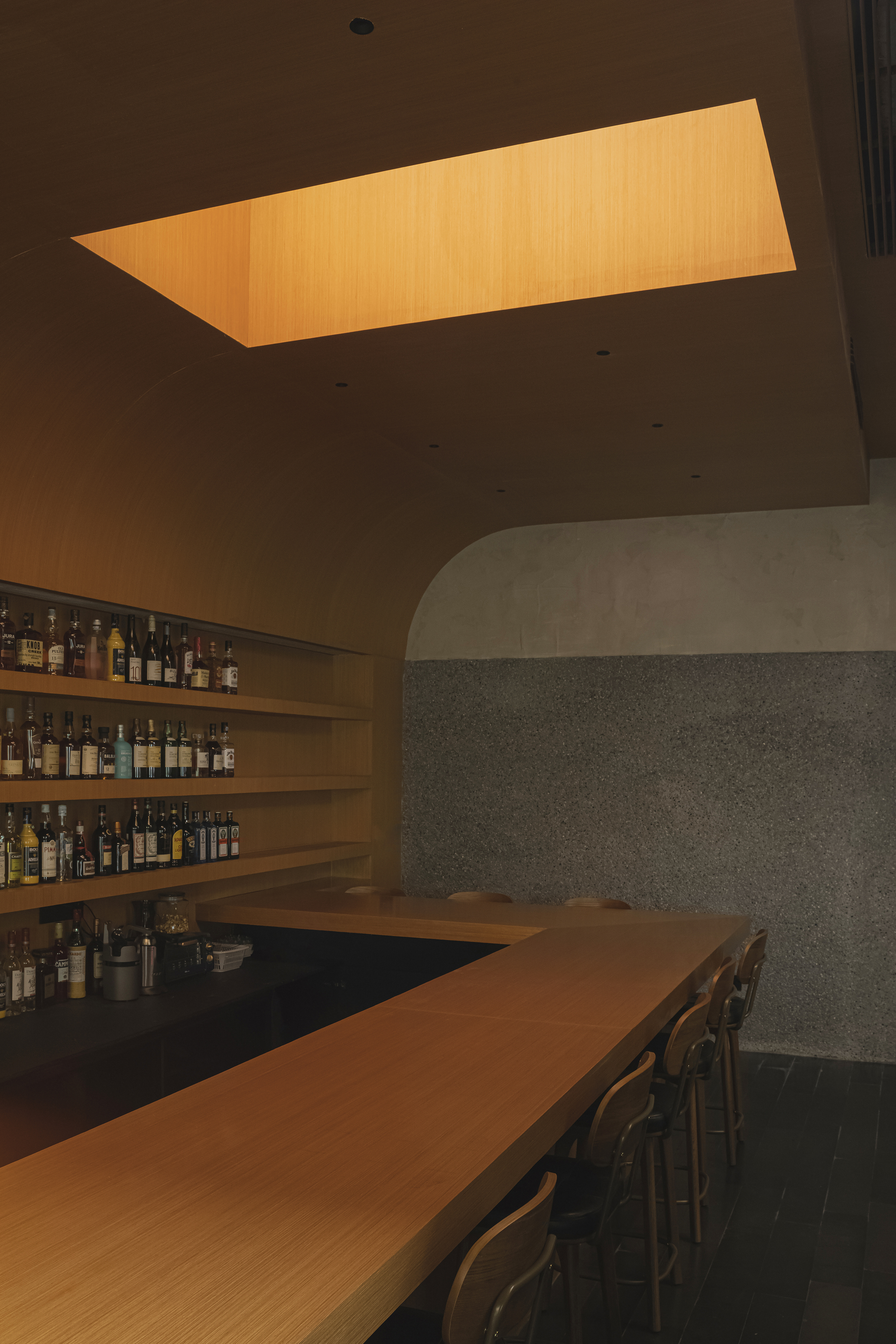
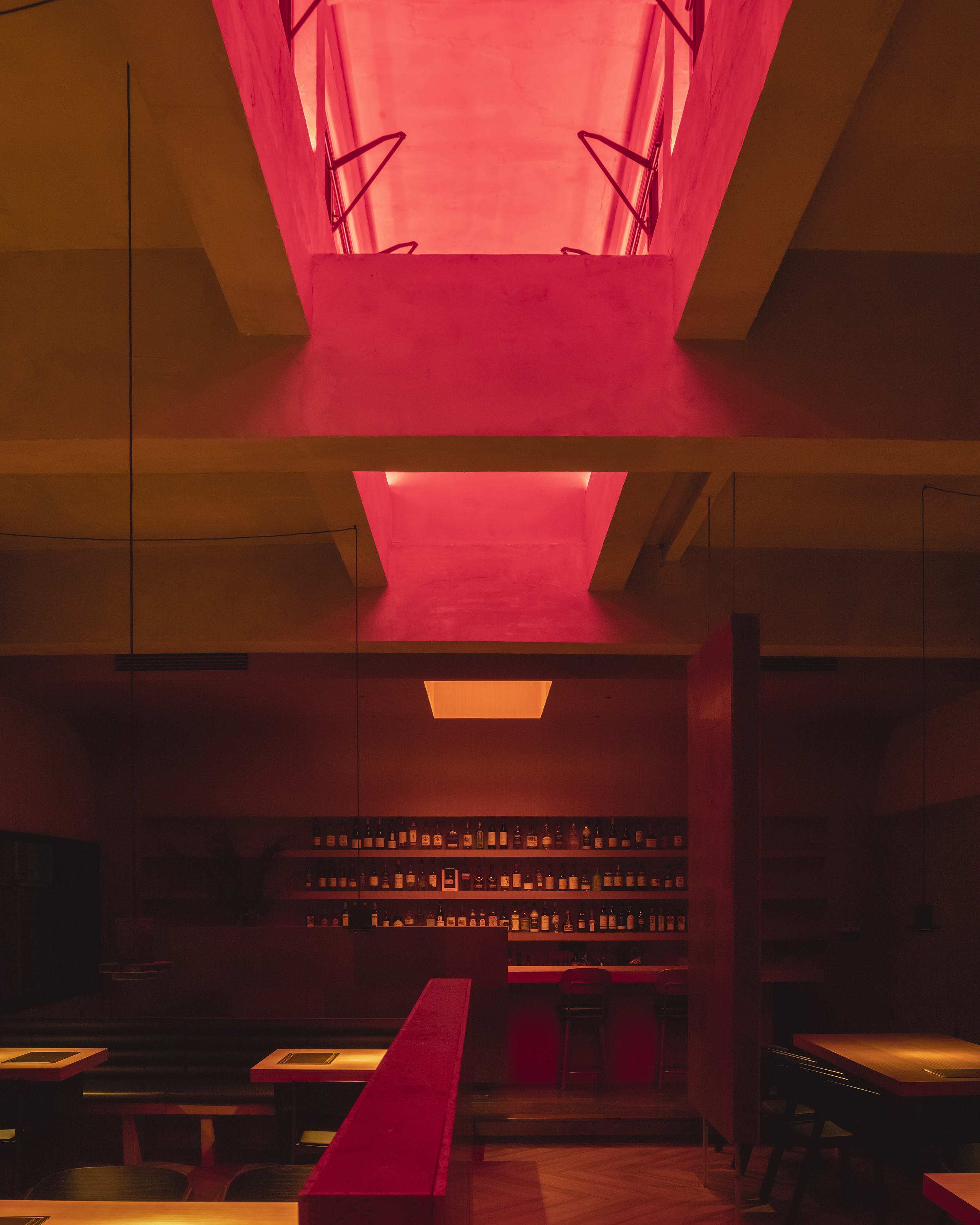
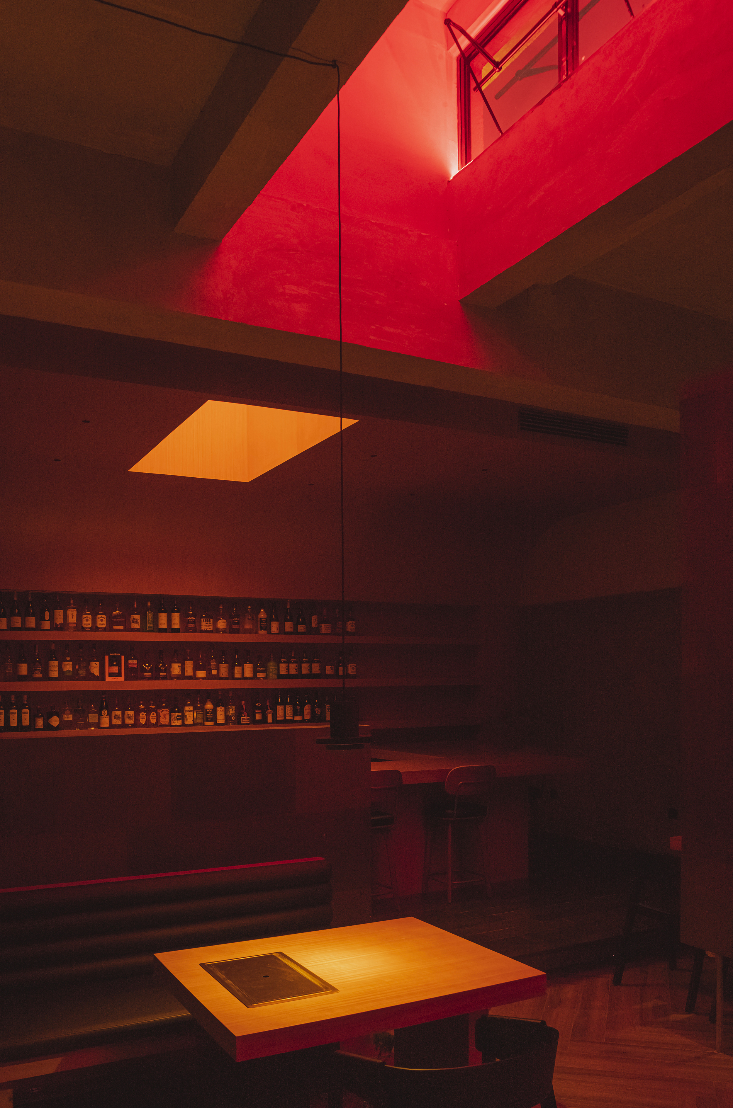
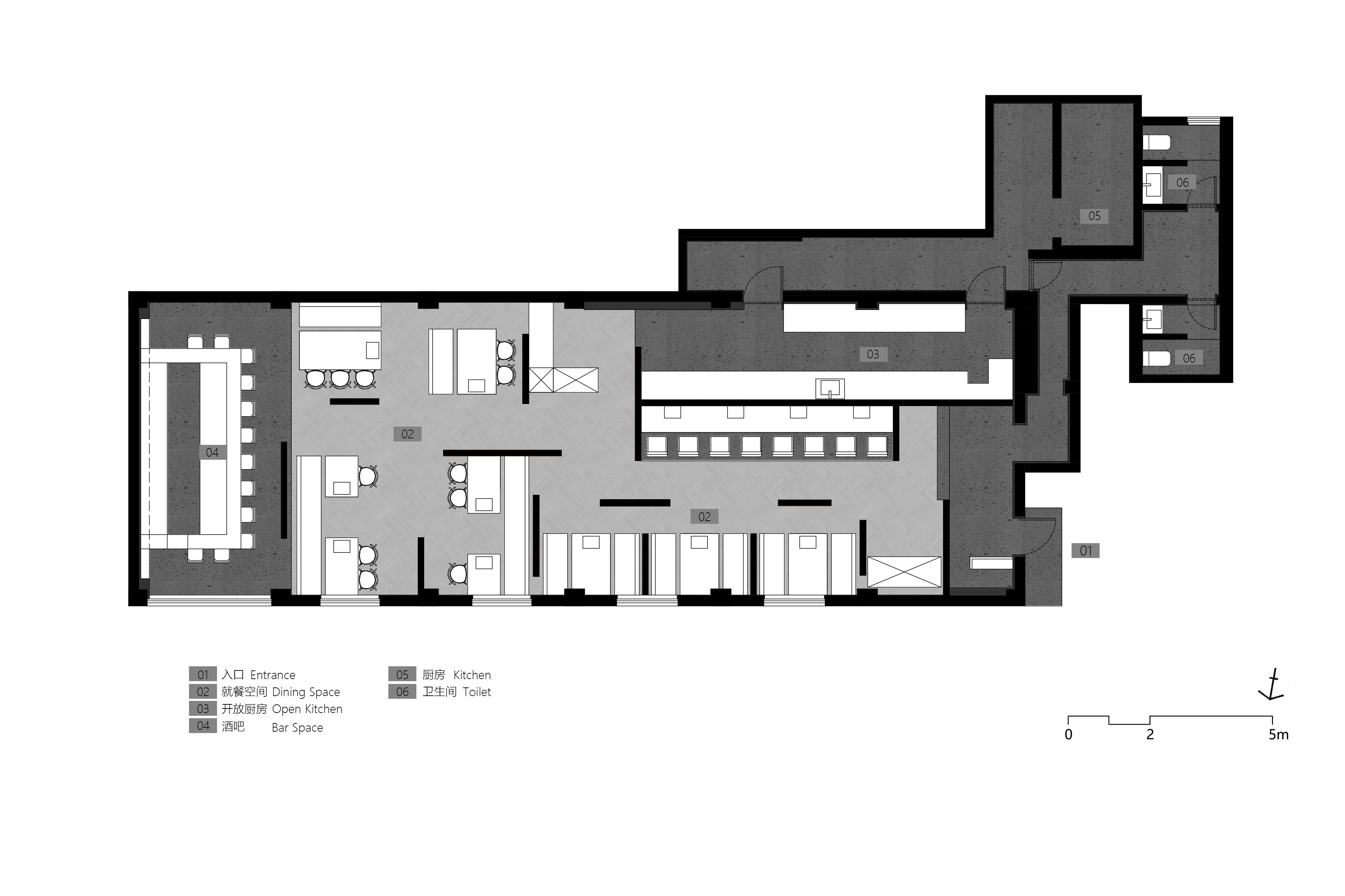
Set in an old warehouse in Guiyang’s historic district, once a mooncake factory for the Guilong Hotel, the project transforms the space into a hybrid of Japanese yakiniku restaurant and Western-style bar. The design layers atmosphere, function, and structure: the bar shapes the ambience, the restaurant defines the scale, and the industrial shell provides texture and light.
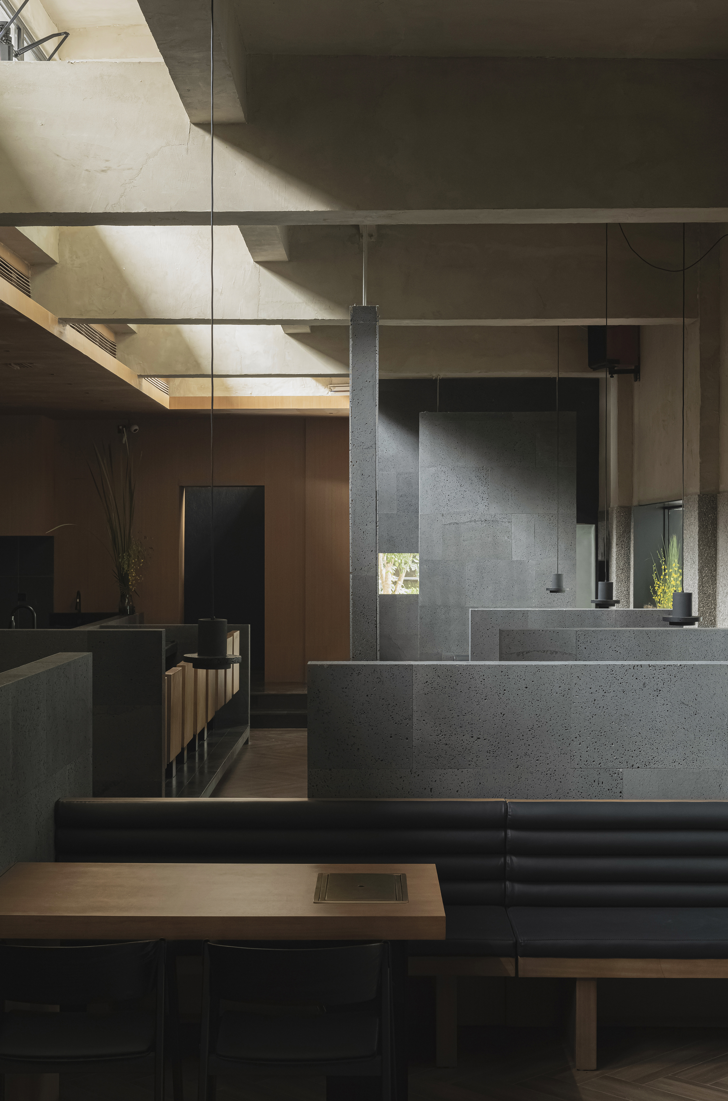
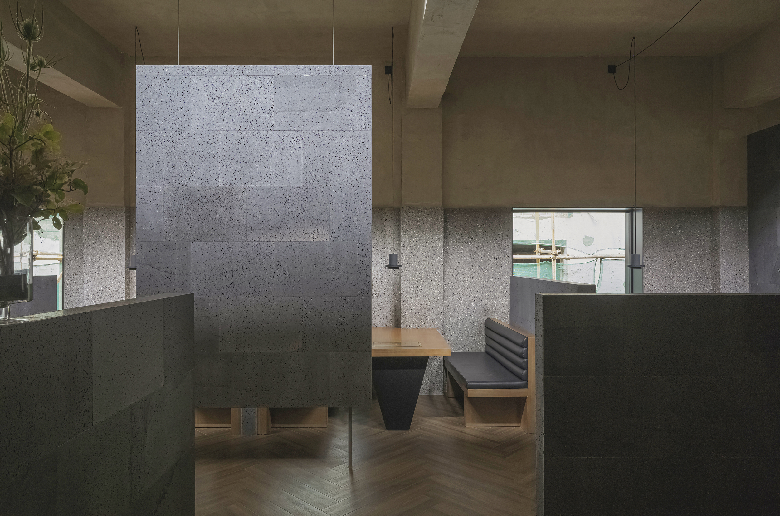
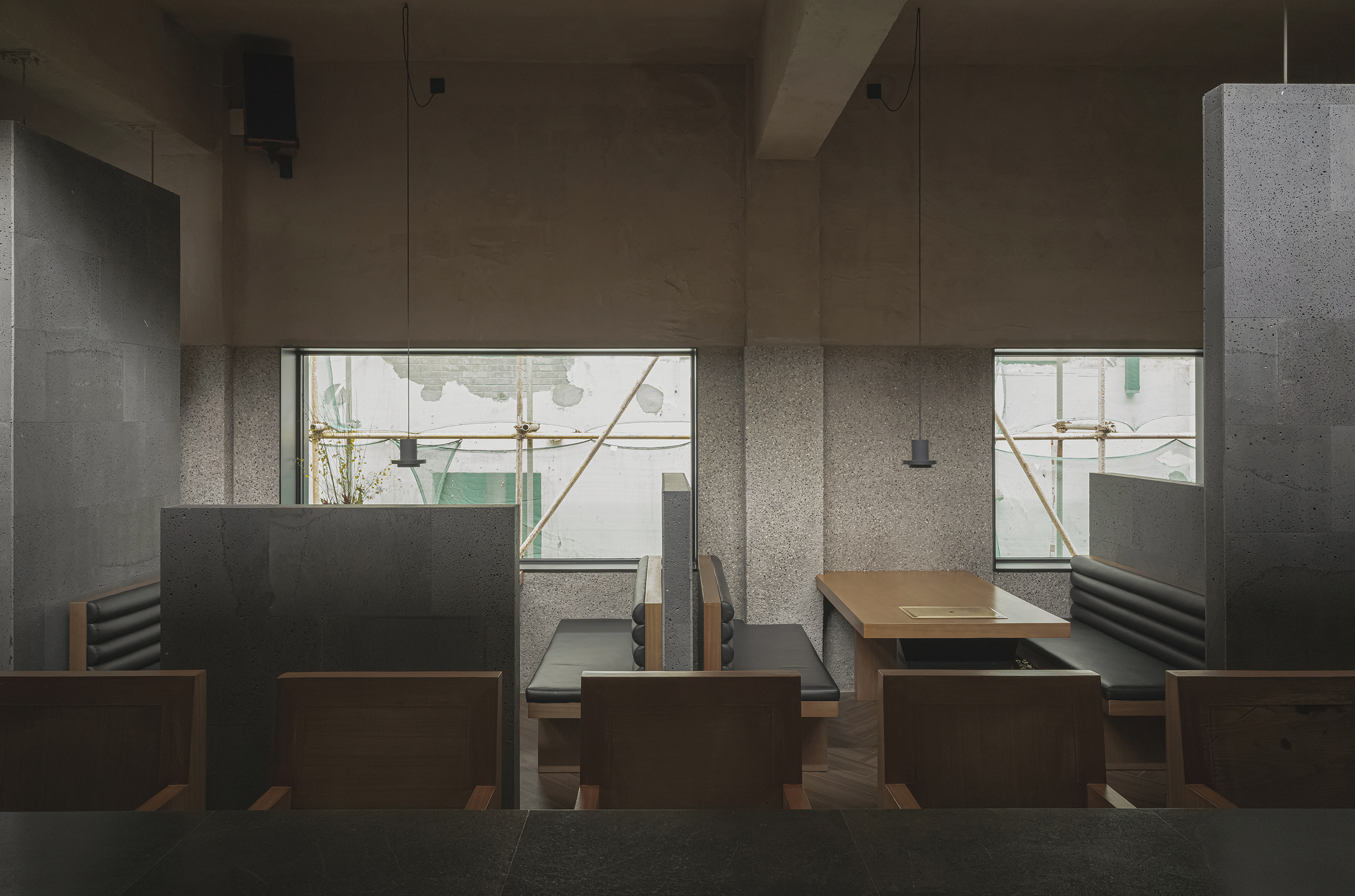
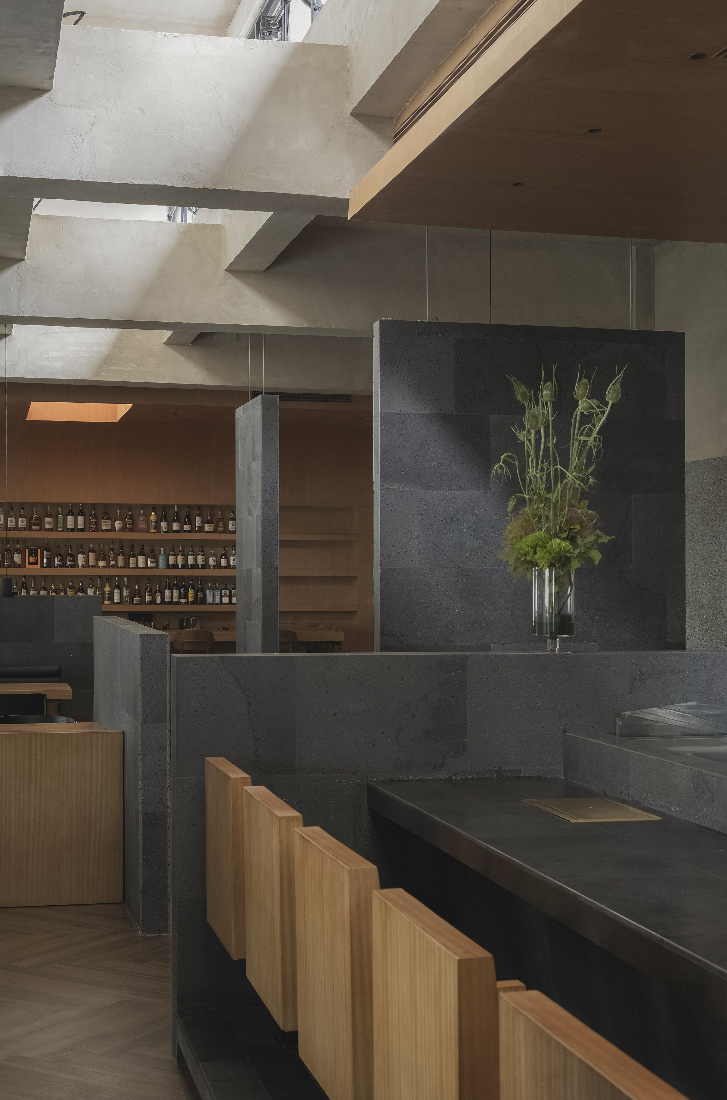
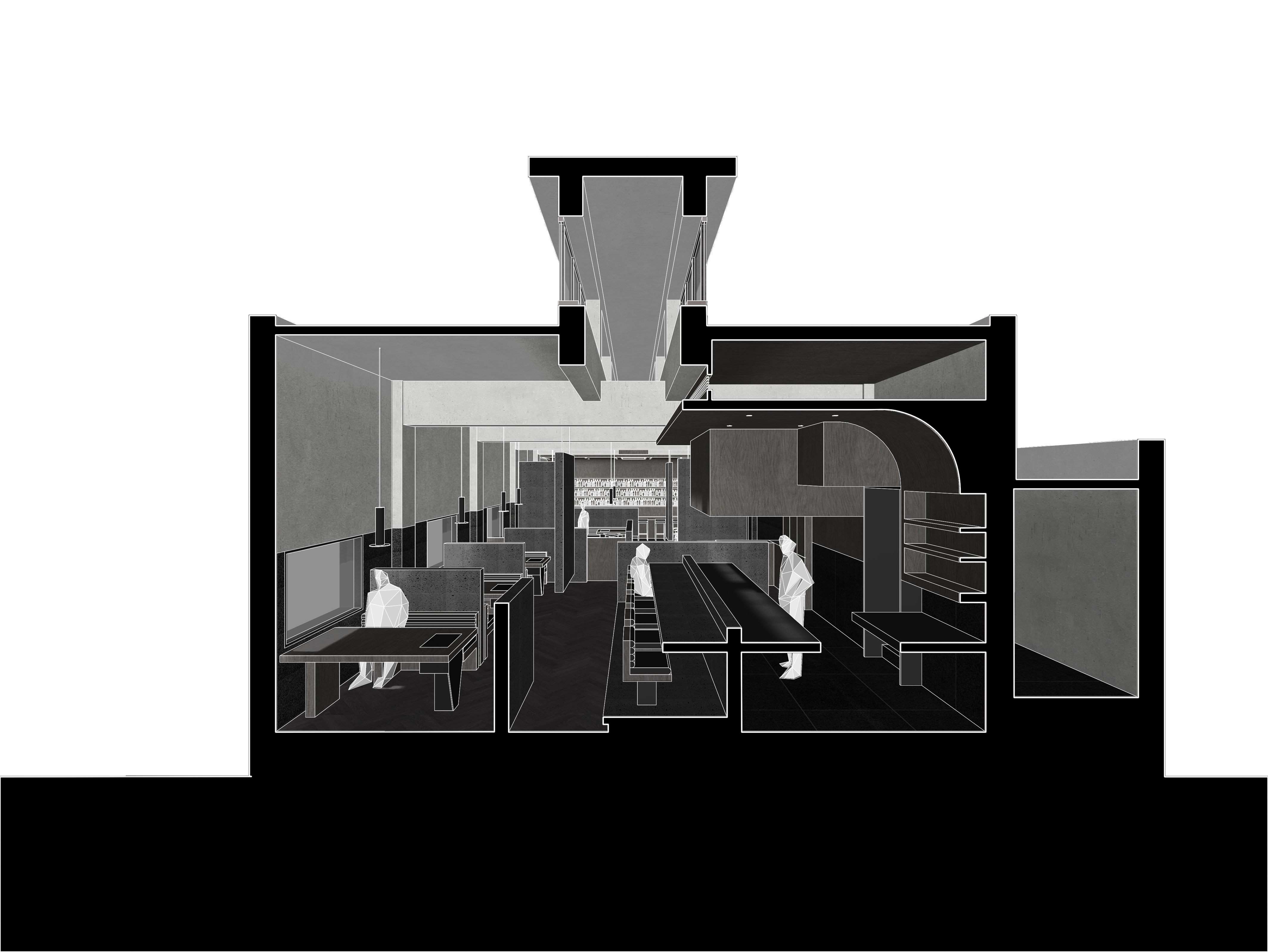
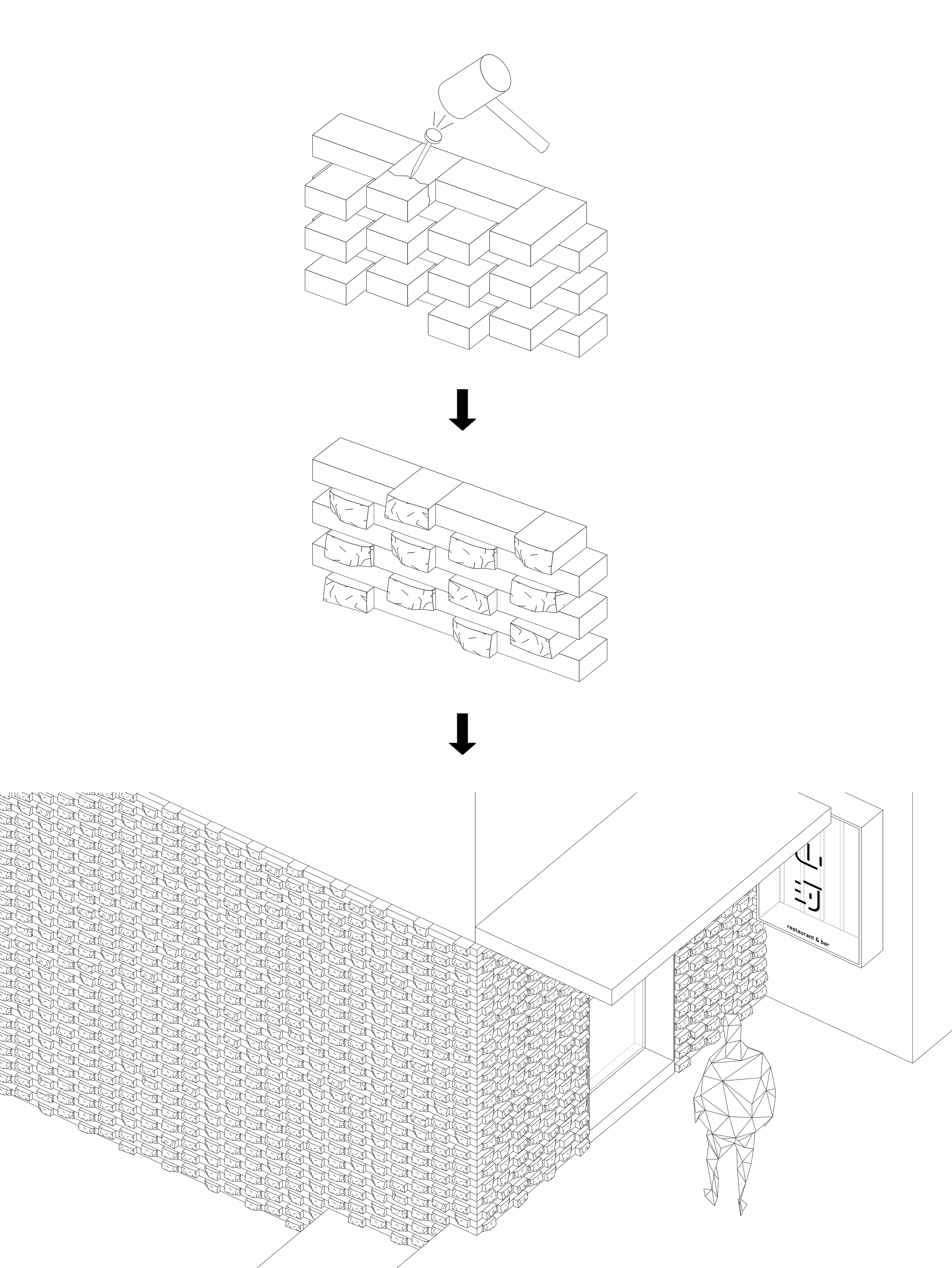
Gray basalt “floating walls” of varying heights divide the interior, offering privacy while maintaining spatial flow. Their deliberate arrangement balances visibility and enclosure, creating a dynamic spatial rhythm. The façade preserves the existing red brick texture, partially broken to reveal a handcrafted quality that integrates with the surrounding cityscape.
High windows—retained despite redevelopment pressures—bring ritual and light to the space, glowing softly at night as part of the bar’s luminous composition. Industrial traces are subtly kept: plastered walls, exposed frames, and hidden systems maintain simplicity.
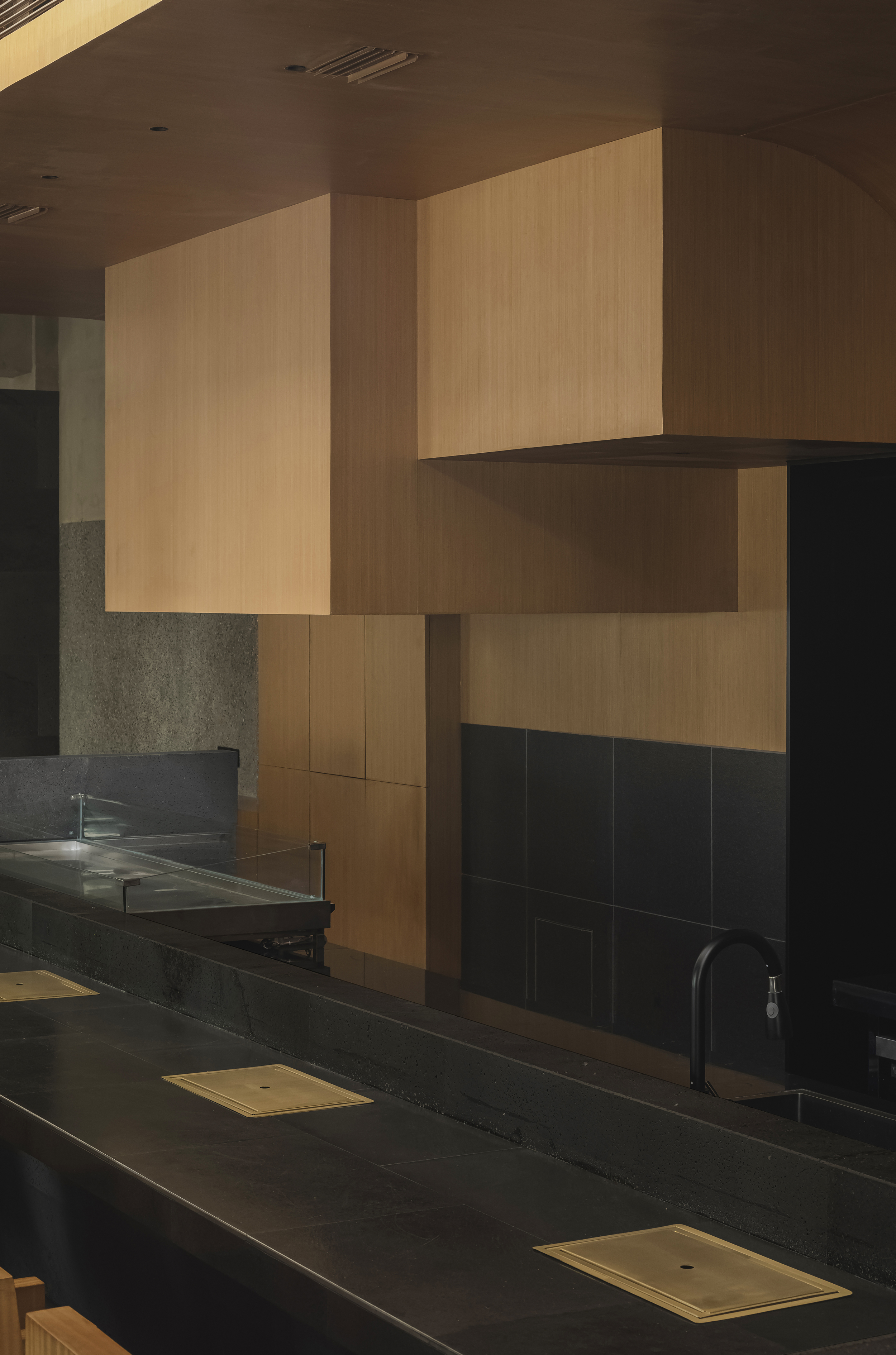
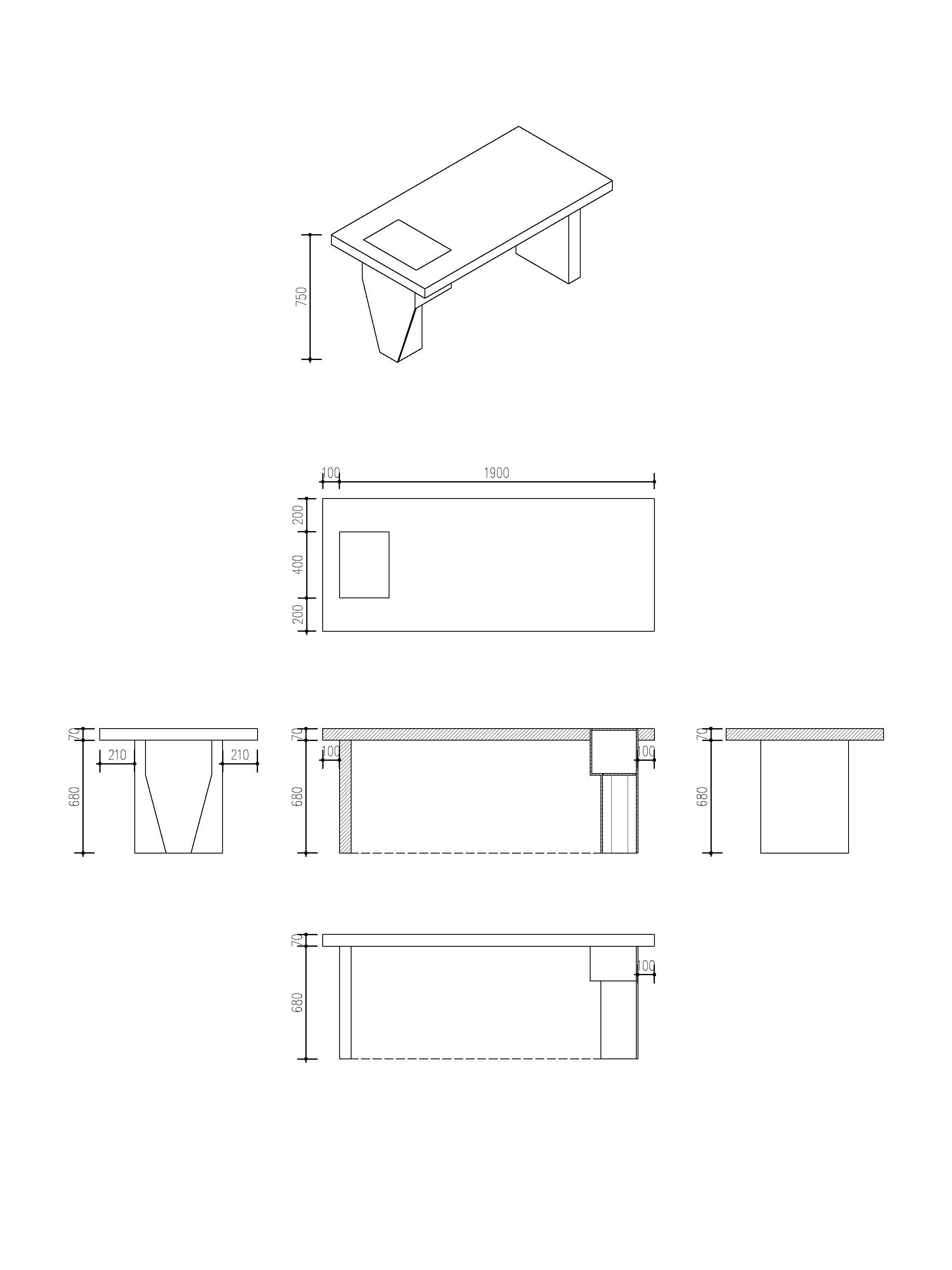
Three material layers—wood veneer ceilings, basalt partitions, and wooden furniture—form a warm, restrained palette. Custom tables conceal ventilation ducts within sculptural legs, uniting function and form. The visual identity design extends this spatial language through curved and linear elements, creating coherence between architecture and branding.
The result is a modern yet grounded interpretation of Japanese aesthetics—balancing openness and privacy, roughness and refinement, stillness and motion.


DRAWINGS
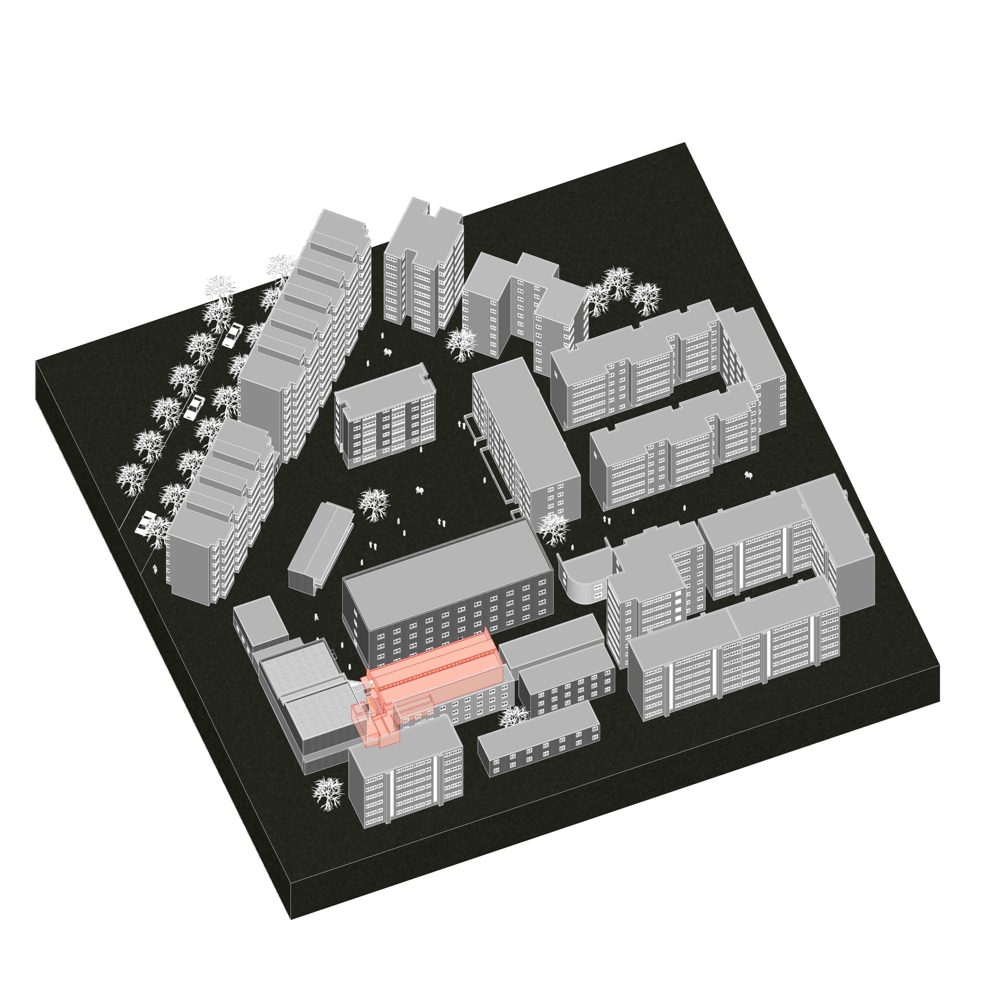


PROJECT INFO
Completion Year: 2022
Built Area (m2 or sqft): 300m2
Project Location: Guiyang, China
Design Team: Wang Jianling,Li Mingjing,Pan Yiming
Photographer: Van